JANSSEN / JOHNSON & JOHNSON · 2023-24 · LEAD UI DESIGNER
Janssen BISO
Platform Redesign
A patient-centered digital overhaul for pulmonary arterial hypertension patients and caregivers — balancing clinical rigor with emotional resonance.

ROLE & CONTRIBUTIONS
What I owned on this project
DESIGN
- •End-to-end UI redesign using a modular Bento Box framework
- •Fully responsive interface across all breakpoints
- •Interactive patterns: info wheel, flip cards, risk card stacks
- •Typography & layout strategy to maximize limited visual assets
STRATEGY
- •Re-architected information hierarchy for intuitive journeys
- •WCAG-compliant accessible navigation patterns
- •CTAs engineered to increase community participation
- •Research synthesis into actionable design decisions
THE PROBLEM
A platform that failed its most vulnerable users
PAH patients and caregivers came to BISO seeking community, clarity, and clinical guidance. The existing platform was delivering none of the above — and the stakes couldn't be higher.
Outdated visuals undermining clinical credibility and patient trust
Complex navigation burying critical resources from users
Poor mobile responsiveness on a health-critical platform
Limited imagery creating a cold, impersonal experience
Users unable to find resources even when they existed
No emotional resonance — a document, not a community
RESEARCH
Listening before designing
Every design decision was anchored in research conducted before a single frame was opened in Figma.
Analytics Audit
Identified high drop-off pages and primary friction points through site analytics
User Interviews
Qualitative interviews with PAH patients and caregivers about platform pain points
Competitive Benchmarking
Audited leading health advocacy and pharma platforms for best practices
Feedback Analysis
Reviewed recurring qualitative complaints from existing users
DESIGN APPROACH
Six pillars of the redesign
Information Architecture Overhaul
Re-structured the entire IA into intuitive, task-based user journeys — separating patient from caregiver content, surfacing key resources within two clicks from any page.
Modular Bento Box Layout System
A grid-based card framework replacing long-scroll structures — editorial quality that's highly scannable for cognitively fatigued users without sacrificing visual hierarchy.
Interactive Micro-Experiences
Three custom interaction patterns to convey dense medical information without overwhelming users — making complex data engaging and self-directed.
Accessibility-First Foundation
WCAG compliance as a design foundation, not a checkbox — accessible navigation, sufficient contrast, keyboard navigability, and screen reader compatibility throughout.
Typography as a Design Tool
With limited imagery assets, type hierarchy, scale contrast, and white space became the primary tools for achieving a premium, trustworthy aesthetic.
Mobile-First Responsive Design
Every component designed mobile-first with flexible breakpoints — directly addressing the most critical failure of the original platform.
INTERACTIVE PATTERNS
Making dense medical content approachable
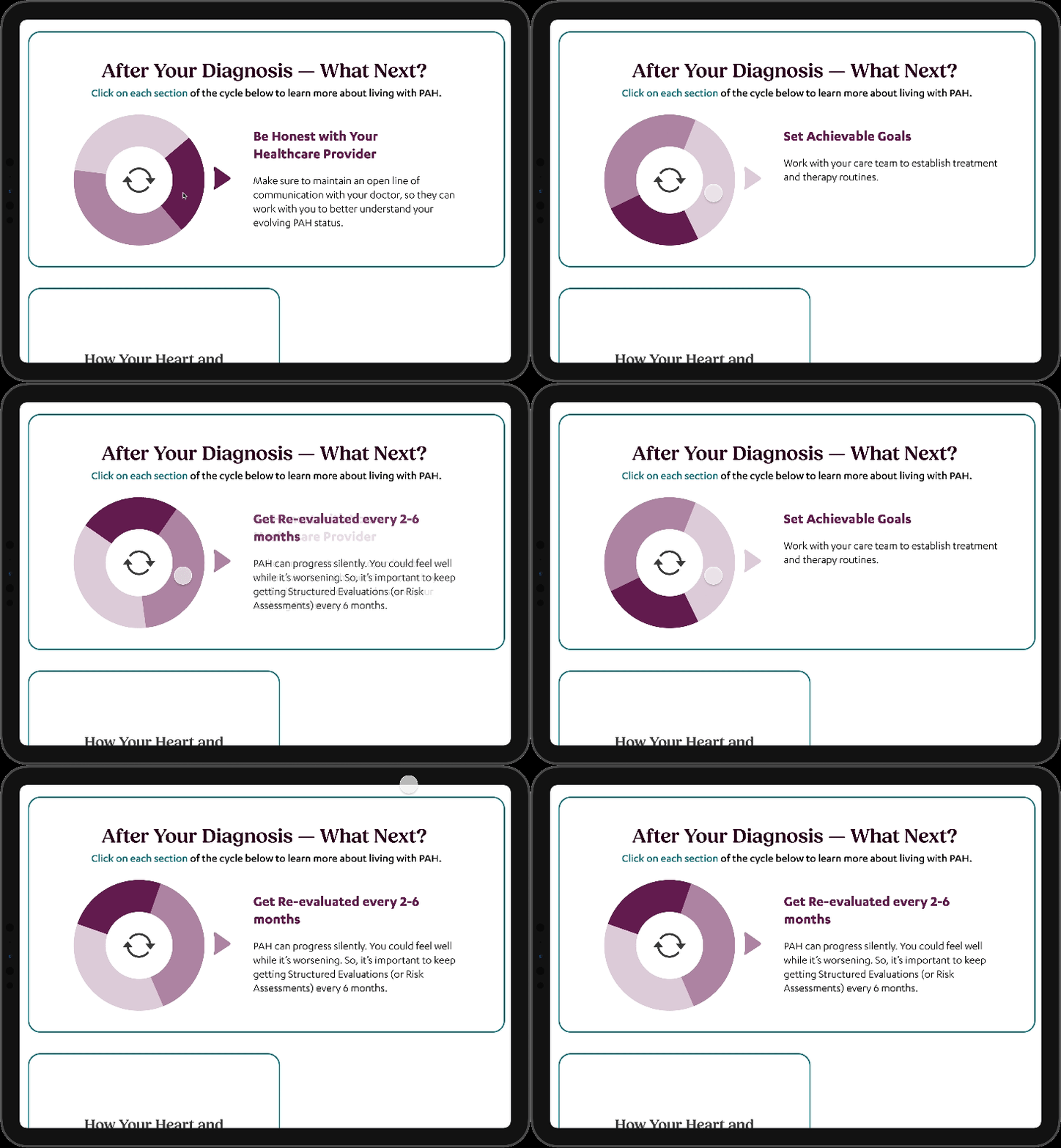
Information Wheel
A rotating interactive wheel conveying a continuous cycle of disease management data — replacing walls of static text.

Scrollable Risk Cards
Dense risk-level content transformed into navigable card stacks — users self-select relevant information without overwhelm.
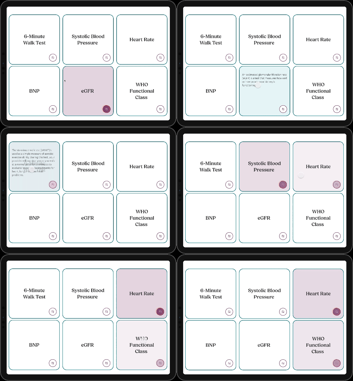
Flip Card Interactions
Dynamic flip cards let users engage with layered content — surface-level for scanning, deeper detail on interaction.
PLATFORM SHOWCASE
Platform Screens
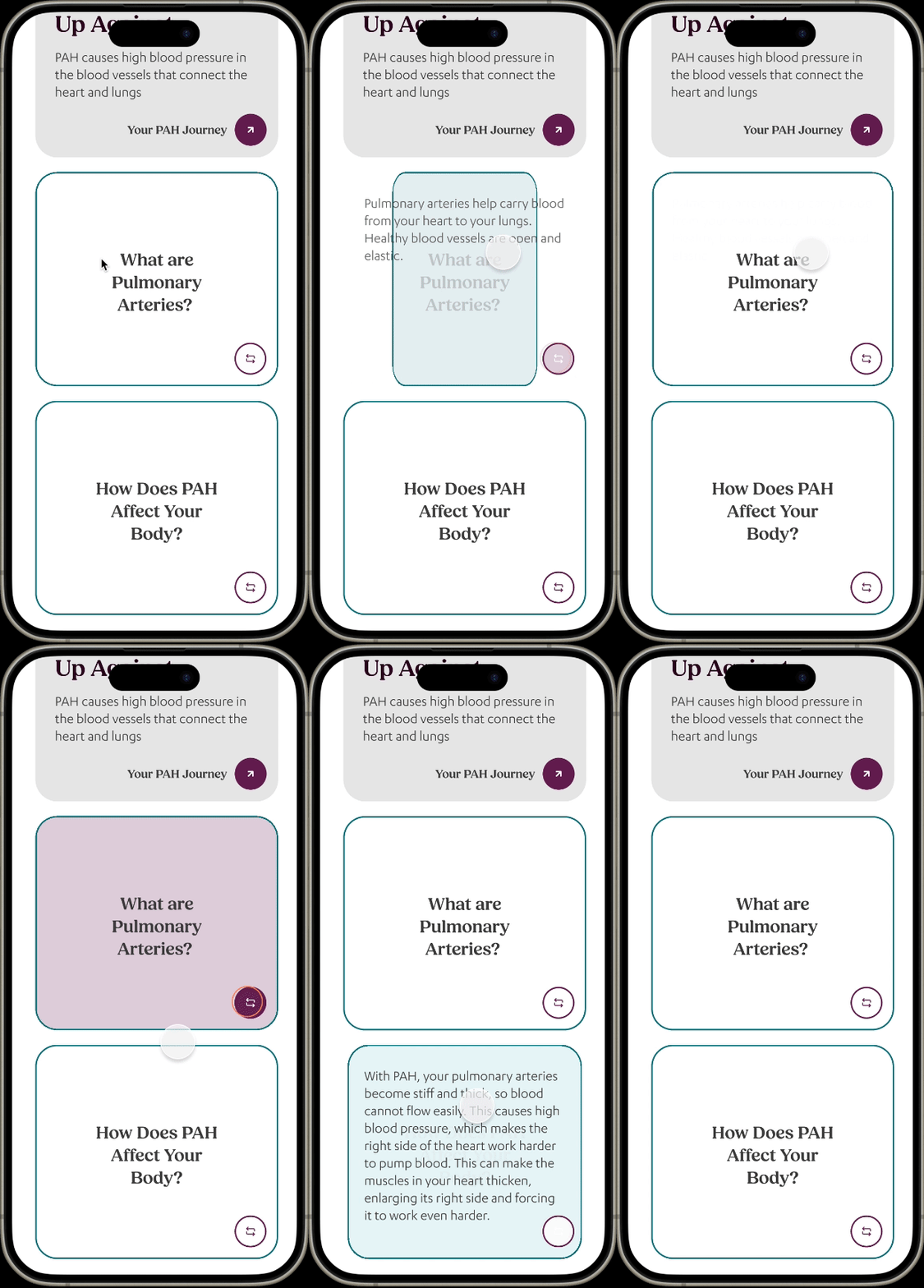
Your PAH Journey
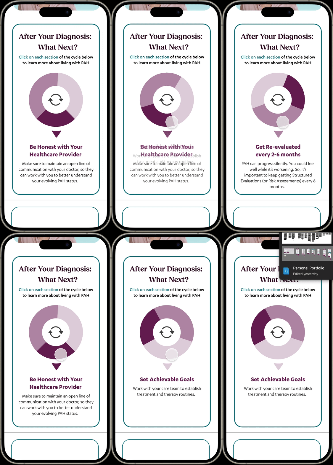
After Your Diagnosis
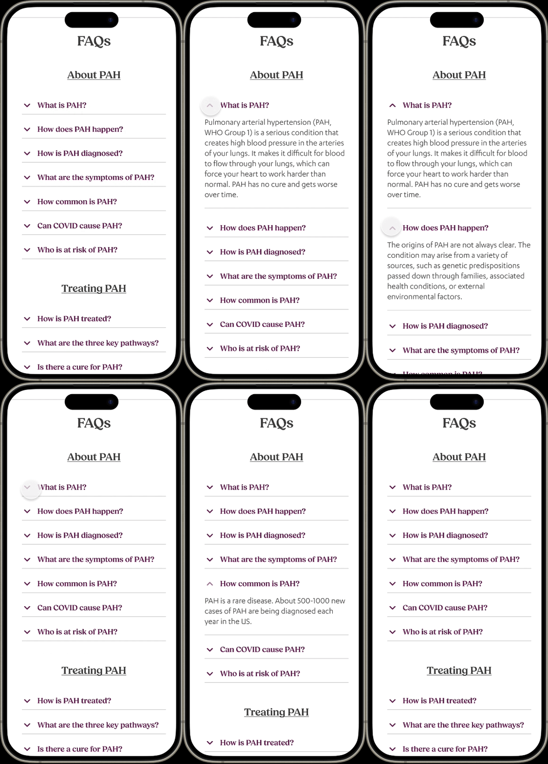
FAQs
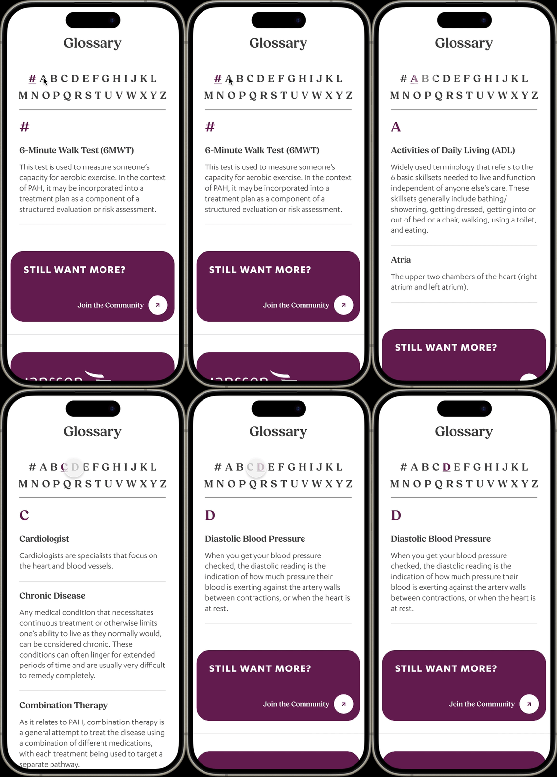
Glossary
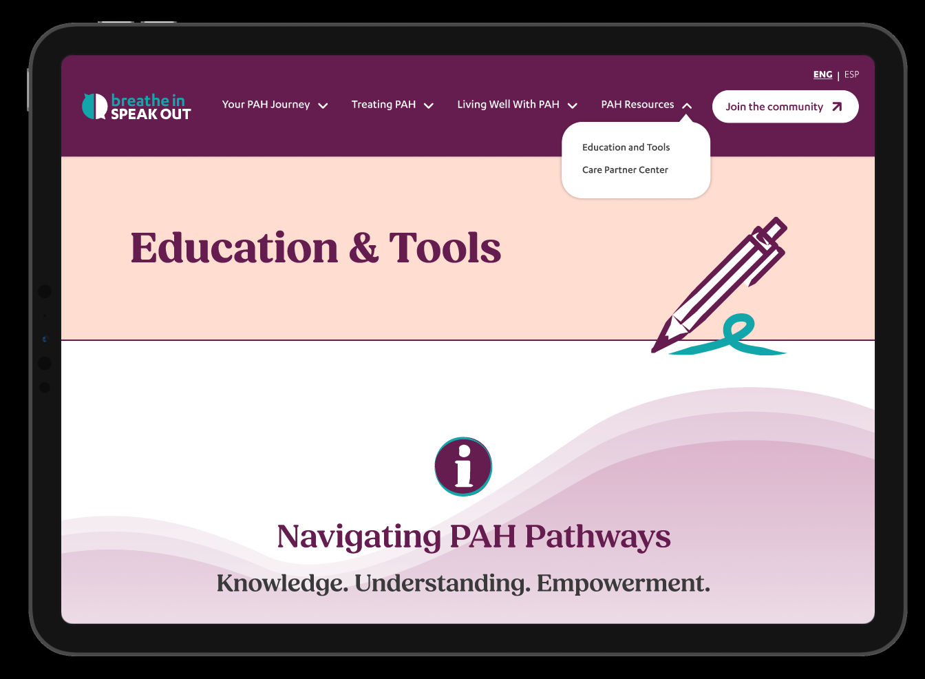
Education & Tools
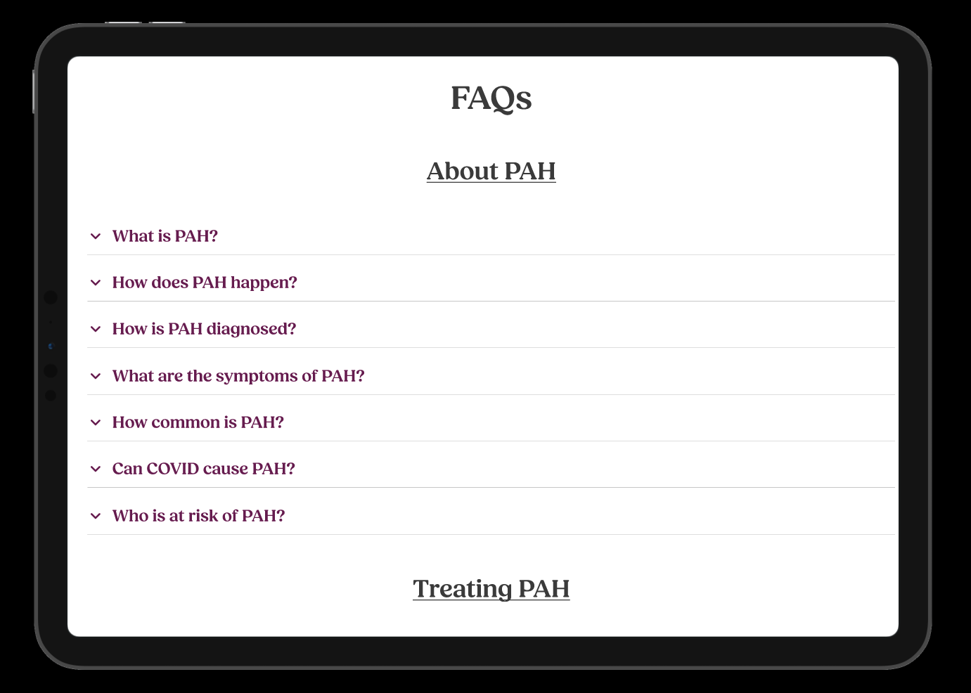
FAQs & Resources
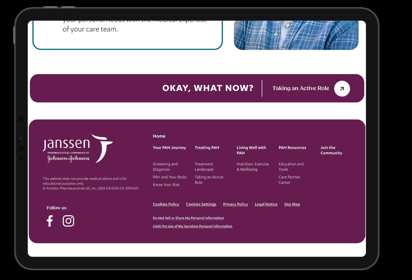
Footer Navigation
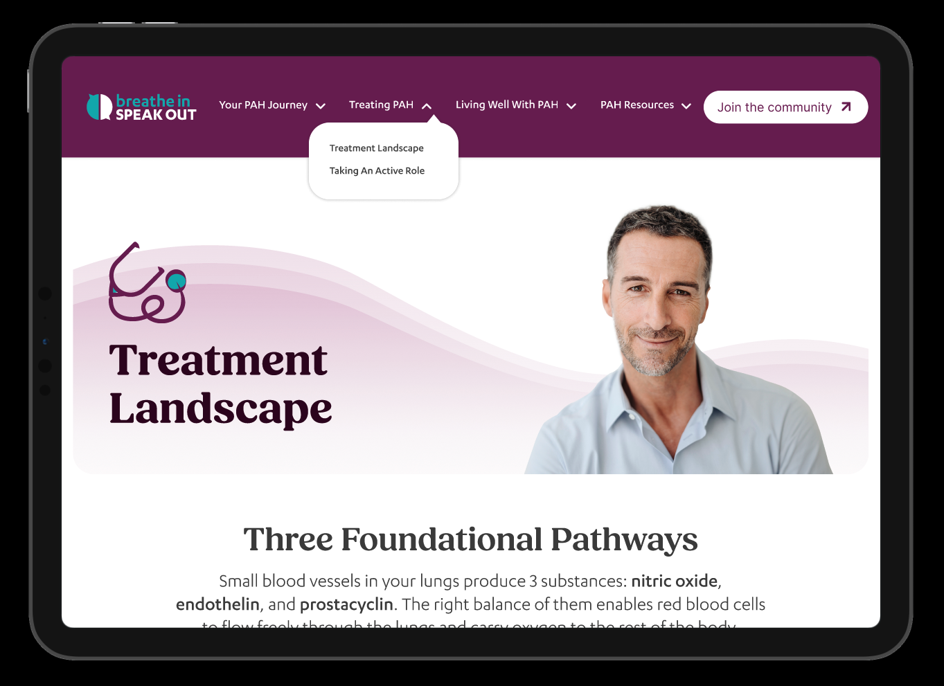
Treatment Landscape
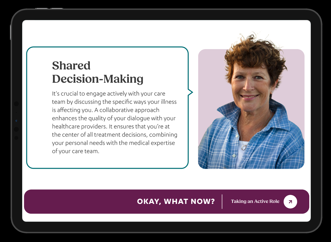
Decision-Making
RESULTS
Meaningful impact across every metric
Within three months post-launch, the redesign delivered measurable improvements across engagement, accessibility, and community participation.
Average session duration
Bounce rate reduction
Mobile usability score
Resource downloads & sign-ups
Patients and caregivers cited improved clarity and ease of navigation in post-launch feedback
Users reported a stronger sense of community and belonging — a primary design objective
Janssen stakeholders noted elevated brand perception and clinical credibility simultaneously
Accessible navigation patterns recognized as a significant improvement for users with disabilities
REFLECTION
"Trust is a design material."
Every color choice, navigation pattern, and typographic decision either added to or subtracted from the patient's ability to trust the platform — and by extension, their care journey. Designing for patients managing a life-altering diagnosis is a reminder that great UX is never just about aesthetics. It's about reducing cognitive burden at someone's most vulnerable moments. Enterprise healthcare design demands the same creative ambition as consumer product design. The constraints are real, but so is the opportunity to genuinely improve lives.
Molly Mittal
Product & Visual Designer · FCB Chicago · 2023-24